SPOTLIGHT
Black, White and Gray
Dec 1, 2014
The neutral palettes have always been on trend ever since the contemporary and modern movement in design took off. Almost all artists and designers of the modern age encouraged the use of these impersonal colors. Chief among them are black, white, and gray. Some may even argue that these three are not even technically colors. For the sake of this article, let’s assume they are in the context of color as a visual property.
Now, the great thing about these three colors is that they are pretty much agnostic in terms of harmony to every hue on the color wheel. They work with all the colors, from warm reds to cool blues, to convey different sorts of emotions and meanings. Better yet, they tend to reinforce the statement being made by the other colors.
The Strength of Black
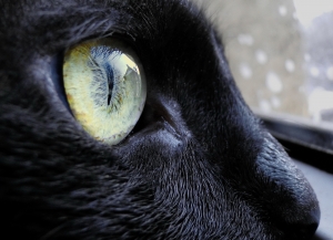
Needless to say, black is a powerful color. Black is the ultimate form of sophistication. Think about the little black dress that women love to wear to parties and social gatherings. Think about the power of black as a symbol of condolences and mourning. Black sits in the top of the spectrum, ready to assert its will forcefully to any color dare stand beside it. But when it does happen, surprisingly black takes the secondary role, and the other
color shines brighter than ever. How many times have you seen black designs beautifully accented with splashes of red or yellow? Although these colors grab your attention first, it is the presence of black that make them stand out. And therein lies the real strength of black—its role as a supporter.
And so in much of contemporary design, black is used more of a backdrop for some things meant to be visually more important. When the backdrop is predominantly black, the focus tends to be on whatever object is on the foreground. Just like how the cute, black dress is really not the star of the night—it’s the face or the figure of the woman wearing it.
The Power of White
As the symbol of purity and innocence, white has a lot going for it. White never imposes itself; you could be in a sea of white and still feel perfectly comfortable. Because of the lack of hue, it can be everywhere and be never noticed. It is the underdog to all of the other colors of the spectrum, quite the opposite to black. Only when the rest of the colors are gone, do we understand its existence. In that
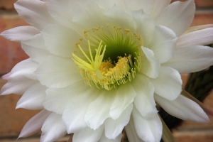
sense it is neutral; it is a color that survives only because other colors do not exist. But this very nature of white—its apparent reliance on other colors—is what makes it quite powerful.
The negative existence of white runs deep in the rules of design itself. White in design has become synonymous to empty space. It has become responsible of a foreground’s form just as much as the actual object itself. The form of any object surrounded by white is reinforced; the very essence of the object trapped within the confines of empty white space. Think about a white sheet of paper. It remains empty and of not much significance until you draw or write something in it. Whatever was drawn becomes the foreground, but inevitably, you also define the empty white space around it.
White, when used beside other colors, amplifies the shape of the figure it surrounds. The more open the space around the object is, the easier it is for the mind to notice the lines and boundaries. So more than just providing contrast, it also offers relief on forming visual forms—the imagination being made more accessible with a sliver of white or empty space
The Flexibility of Gray

Gray, of course, is not a single hue but a gradation between black and white. Gray might easily be the most neutral among the three colors being discussed, but gray in itself exhibits an important property that black and white lack—flexibility. What makes gray a very interesting color is that it is more of a chameleon, taking the tone of the colors around it. A gray with a hint of red becomes warm and welcoming; a gray with subtle
shades of blue shows off a sense of coldness and frigidity. In this sense, artists and designers have learned to masterfully blend gray with other subtle colors to achieve the mood they want. It is not surprising how gray has become a de facto choice for minimalist designs.
When placed adjacent to other colors, however, gray takes on a very different role. It inadvertently recedes to the background and pushes the less neutral colors forward. Like black, it strengthens whatever is intended to be in the foreground. For modern designers, gray serves a perfect purpose of focusing on the content, to maximize the visual impact while still keeping the piece interesting. That’s why gray sofas tend to be paired with brightly colored throw pillows or vivid carpets. The contrast that these accent colors provide help bring the best out of any piece.
These three colors—black, white and gray—offer a lot of value to any design. The beauty of it all is that, we have the freedom to choose how we use them. And this is the root of them being called neutral—they can stand on their own, but their true value lies within their relationship with the rest of the colors around them. Of course, this can always be said for any other color; color does not exist in a vacuum. But when it comes to black, white, and gray, their neutrality and versatility, has become their greatest strength.
One Last Toast for the Year
by Post by FOA Team Oct 5, 2016Help us cap off an amazing year of festivities! The final chapter of our 10-Year Anniversary Celebration comes to High Point Market. Join us at the corner of Green Drive and Main Street as we introduce our Supplementary Catalog with hundreds of brand new items for the holiday season. We will have entertainment and open bar for guests
Designer’s Corner: Cozy Candle for Fall
by Post by FOA Team Oct 10, 2019